-
-
Creating New Image Charts in Podio with GlobiFlow
-
Implement a payment form in Podio using Globiflow and Jotform
-
This content has been machine translated dynamically.
Dieser Inhalt ist eine maschinelle Übersetzung, die dynamisch erstellt wurde. (Haftungsausschluss)
Cet article a été traduit automatiquement de manière dynamique. (Clause de non responsabilité)
Este artículo lo ha traducido una máquina de forma dinámica. (Aviso legal)
此内容已经过机器动态翻译。 放弃
このコンテンツは動的に機械翻訳されています。免責事項
이 콘텐츠는 동적으로 기계 번역되었습니다. 책임 부인
Este texto foi traduzido automaticamente. (Aviso legal)
Questo contenuto è stato tradotto dinamicamente con traduzione automatica.(Esclusione di responsabilità))
This article has been machine translated.
Dieser Artikel wurde maschinell übersetzt. (Haftungsausschluss)
Ce article a été traduit automatiquement. (Clause de non responsabilité)
Este artículo ha sido traducido automáticamente. (Aviso legal)
この記事は機械翻訳されています.免責事項
이 기사는 기계 번역되었습니다.책임 부인
Este artigo foi traduzido automaticamente.(Aviso legal)
这篇文章已经过机器翻译.放弃
Questo articolo è stato tradotto automaticamente.(Esclusione di responsabilità))
Translation failed!
Creating New Image Charts in Podio with GlobiFlow
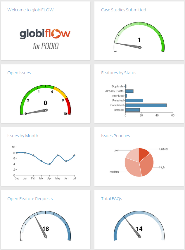
Podio has given users the option to make custom report widgets and now with GlobiFlow we can create visual charts for data. A great example would be the dashboard in the GlobiFlow for Podio Users workspace.
Solution Explained
It’s actually quite easily done.
-
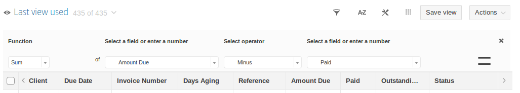
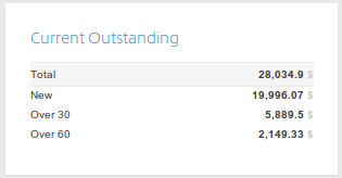
Make sure the data you wish to be on the graph is a Podio Report widget within the App. I chose to create a custom report which calculates the amount outstanding only for selected status fields.
-
This will return the following report widget in your Podio App.
-
-
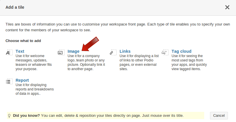
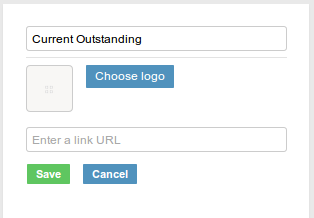
Next, an image tile must be added to the page you wish to have the graph.
-
Once it is placed, repeat the process to create an image tile in the Workspace Homepage - the dashboard.
-
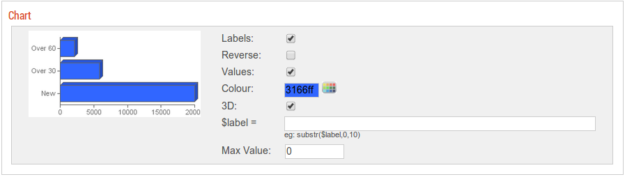
Open GlobiFlow and Refresh to update the changes. Select the App and create a New Chart:
For multiple fields of data - choose any of the following:
- Line
- Area
- Vertical Bar
- Horizontal Bar
- Pie
-
Gauge (on Total)
-
Once you have chosen the chart and configured the colors, labels and values, you can choose the destination. This is the Image Tile you created at the beginning.
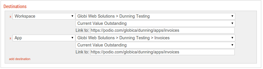
Note:If the image tile is not in the list to select, check the Podio dashboard and make sure you refresh your setting in GlobiFlow.
-
Have a report with only ONE number or use the Total of a report? Set the gauge
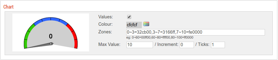
Advanced Stuff
If you have very long labels, you can set a label function (options). For example:
substr($label,0,10)
will result in only the first 10 characters of the label.
<!--NeedCopy-->
For gauge charts, you can set the zone colors in the format:
from~to=hexcolor
For example, if you have a gauge from 0 to 100, and want 0-60 to be green, 60-80 to be yellow, and 80-100 to be red, use:
0~60=00ff00,60~80=ffff00,80~100=ff0000
<!--NeedCopy-->
Share
Share
In this article
This Preview product documentation is Citrix Confidential.
You agree to hold this documentation confidential pursuant to the terms of your Citrix Beta/Tech Preview Agreement.
The development, release and timing of any features or functionality described in the Preview documentation remains at our sole discretion and are subject to change without notice or consultation.
The documentation is for informational purposes only and is not a commitment, promise or legal obligation to deliver any material, code or functionality and should not be relied upon in making Citrix product purchase decisions.
If you do not agree, select I DO NOT AGREE to exit.